When designing a single image promotion for a wide range of devices, it’s important to understand how our application will fit it to the device screen:
– Anchors to top
– Fits to width
To ensure that the image fits vertically, you should always design for the tallest aspect ratio which is currently 9:21
We recommend designing a 9:21 image w/ a resolution of 720×1760.
This size will have a wide compatibility with phones in your stores and the resultant size of the file presents good image quality while maintaining a small file size.
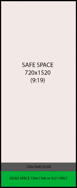
While designing your 9:21 promo, keep all your content within the safe space. This will ensure that shorter devices still display the entire contents of the promotion.
The image to the left demonstrates designing within the Safe Space. The full promotion fits within a 9:19 window, anchored to the top and constrained to width. Any content below is simply the primary background. How much background is displayed is dependent on the size of the device.
If the device is taller than the final image, a white horizontal bar will be displayed, breaking the immersion of the promotion.
Other Promotion Sizes to Consider:
A few device categories should have bespoke promotions designed for them to utilize the display area best:
- Apple Tablets – 1080×810 (3:2)
- Android Tablets – 1080×675 (5:4)
- Z Fold3 (unfolded) – 1597×1994 (11.24:9)